On this page
2026-06-07
Building a Minimal Technical Blog with shadcn, Figma, and Cursor
Most personal blogs fail for a boring reason: they optimize for launch day, not for the hundredth article. The layout gets in the way, the theme drifts, and every new post becomes a small redesign project.
This post documents how <NS> approaches the problem — a minimalist technical blog where reading stays central, tokens stay consistent, and design-to-code stays repeatable.
Why static-first
A blog that renders from Markdown at build time is predictable. You get fast pages, simple hosting, and a content model that survives framework churn.
The pipeline looks like this:
- Author writes
.mdfiles with frontmatter. - Next.js reads them during
next build. - Pages are statically generated with headings, code blocks, and images already resolved.
Benefits you feel immediately
- No database for early experiments.
- Git-backed content — every post is reviewable in PRs.
- Predictable performance — no server round-trip for readers.
Trade-offs worth accepting
- Rebuild required after publishing (fine for personal sites).
- No real-time comments without a third-party widget.
- Media management is your responsibility (local
public/or a CDN later).
The triple-column layout
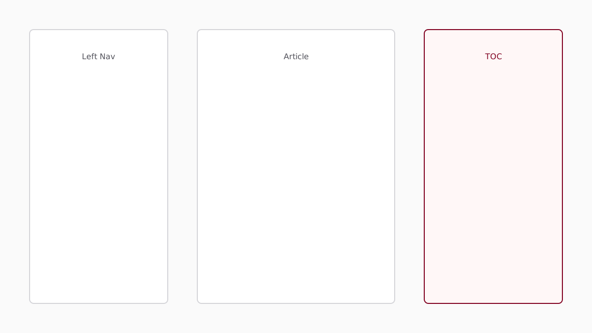
The reading experience borrows from shadcn/ui docs: navigation on the left, article in the center, and a sticky On this page tree on the right.
// app/blog/[slug]/page.tsx (simplified)
export default async function BlogPostPage({ params }) {
  const post = await getPostData(params.slug)
  const tocItems = post.toc ?? []

  return (
    <div className="flex gap-8">
      <BlogNavSidebar posts={allPosts} currentSlug={slug} />
      <article className="max-w-2xl flex-1">
        <MarkdownContent content={post.content} />
      </article>
      <BlogTocSidebar items={tocItems} />
    </div>
  )
}
On mobile, the table of contents collapses above the article so readers still get anchor navigation without sacrificing width.
Left sidebar responsibilities
The left column answers: where am I in this site?
- Link to all posts
- Highlight the current article
- Stay sticky while scrolling
Right sidebar responsibilities
The right column answers: where am I in this article?
- Extract
h2andh3headings from Markdown - Highlight the active section with Intersection Observer
- Use maroon accent only for the active node
Markdown as the source of truth
Posts live in content/posts/*.md with YAML frontmatter:
---
title: "Building a Minimal Technical Blog"
date: "2026-06-07"
excerpt: "A walkthrough of the <NS> reading experience."
tags:
  - nextjs
  - shadcn
relatedSlugs:
  - design-systems-with-shadcn
---
The CMS layer reads files from disk today. Tomorrow it can swap to a GitHub-backed source without changing page components.
// lib/cms.ts
export async function getPostData(slug: string) {
  const markdownPost = getMarkdownPost(slug)
  if (markdownPost) return markdownPost

  // TODO: remote CMS fetch
  return getLegacyPost(slug)
}
Parsing headings for the TOC
Headings are extracted at build time so the right sidebar does not depend on client-side DOM scraping:
import GithubSlugger from "github-slugger"

export function extractHeadingsFromMarkdown(markdown: string) {
  const slugger = new GithubSlugger()

  return markdown.split("\n").flatMap((line) => {
    const h2 = line.match(/^##\s+(.+?)\s*$/)
    const h3 = line.match(/^###\s+(.+?)\s*$/)

    if (h2) {
      const title = h2[1].trim()
      return [{ id: slugger.slug(title), title, level: 2 as const }]
    }

    if (h3) {
      const title = h3[1].trim()
      return [{ id: slugger.slug(title), title, level: 3 as const }]
    }

    return []
  })
}
rehype-slug assigns the same IDs during render, which keeps anchor links and scroll-spy in sync.
Code blocks that respect the theme
Syntax highlighting uses Shiki with light and dark themes. Fenced blocks pass through a server component so highlighting happens at render time, not in the browser.
import { codeToHtml } from "shiki"

export async function CodeBlock({ code, language }: CodeBlockProps) {
  const html = await codeToHtml(code, {
    lang: language,
    themes: {
      light: "github-light",
      dark: "github-dark",
    },
  })

  return (
    <div
      className="overflow-x-auto rounded-lg border bg-muted/40"
      dangerouslySetInnerHTML={{ __html: html }}
    />
  )
}
Inline code stays compact: pnpm dlx shadcn@latest add avatar installs primitives without disturbing the prose rhythm.
Example CSS token block
Theme surfaces should always route through semantic variables:
:root {
  --background: oklch(1 0 0);
  --foreground: oklch(0.141 0.005 285.823);
  --accent: oklch(0.396 0.141 20.8);
}

.dark {
  --background: oklch(0.141 0.005 285.823);
  --foreground: oklch(0.985 0 0);
  --accent: oklch(0.52 0.16 20.8);
}

@theme inline {
  --color-background: var(--background);
  --color-foreground: var(--foreground);
  --color-accent: var(--accent);
}
Shell commands for local dev
cd shadcnExperiments
pnpm install
pnpm dev
Open http://localhost:3000/blog/building-a-minimal-technical-blog to verify headings, code blocks, and images.
Theme variables and maroon accents
Monochrome carries the layout. Maroon carries interaction.
Reserve var(--accent) for:
- Active TOC entries
- Inline links inside articles
- Hover states on social links
- Focused navigation items
Everything else stays on background, foreground, muted, and border. The result is a calm page that still feels intentional when you click.
tweakcn workflow
- Tune palette in tweakcn.
- Export light + dark CSS variables.
- Paste into
globals.cssand optional presets inthemes.ts. - Validate in Figma with the same variable names from the community kit.
Rule: never rename tokens per tool. Names are the contract; values are the theme.
Scroll-tracking table of contents
The right sidebar uses IntersectionObserver with a conservative rootMargin so the active heading updates slightly before it hits the top edge — similar to documentation sites you already know.
const observer = new IntersectionObserver(
  (entries) => {
    const visible = entries
      .filter((entry) => entry.isIntersecting)
      .sort((a, b) => headings.indexOf(a.target) - headings.indexOf(b.target))

    if (visible[0]?.target.id) {
      setActiveId(visible[0].target.id)
    }
  },
  { rootMargin: "-96px 0px -65% 0px", threshold: [0, 0.25, 0.5, 1] }
)
Why this feels better than click-only TOCs
- Readers maintain context during long technical essays.
- Mobile users still get anchors without a permanent right column.
- Active state uses
text-accent— no extra components required.
Images in Markdown
Images use the standard syntax and render through next/image:
Keep assets in public/images/ until you move to a CDN. Prefer SVG or optimized PNG for diagrams; photography can come later.
About page portraits
The About page uses the same system: a rounded Avatar for the profile photo and an optional banner image below the bio. Swap /images/profile.svg with your own portrait when ready.
Figma and Cursor in the loop
Design screens in Figma with the free shadcn community kit. Implement with Cursor + Figma MCP by mapping frames to existing components — never regenerate buttons or cards from scratch.
Repeatable checklist
- Duplicate the community kit → enable as library.
- Compose screens from instances only.
- Export tweakcn theme → paste variables.
- Implement routes with semantic Tailwind classes.
- Validate light/dark + preset switching.
Conditional UI that collapses cleanly
Related posts render only when relatedSlugs resolves to real articles. Empty arrays remove the block entirely — no “empty state” placeholders breaking the minimalist layout.
{relatedPosts.length > 0 && (
  <>
    <Separator className="my-12" />
    <RelatedPosts posts={relatedPosts} />
  </>
)}
The same pattern applies anywhere data might be missing: footers, sidebars, embeds, and recommendation rails.
What comes next
MDX shortcodes
<InteractiveEmbed />with lazy iframe loading- Image dialog for click-to-zoom
- Admonitions for warnings and notes
Content sources
- GitHub-backed Markdown directory
- Preview deployments per PR
- RSS feed generation
Performance polish
- Route-level static params from
content/posts - OG image generation per post
- Reading time in frontmatter
Closing thoughts
A minimal blog is not a bare blog. It is a focused blog — every element justifies its presence in the reading flow.
If the token contract stays stable across Figma, tweakcn, and code, you spend less time fixing drift and more time publishing essays worth reading.
Start with one long Markdown file, a triple-column layout, and a right-hand TOC that tracks scroll. Ship that, then add MDX superpowers when a post actually needs them.